The Story Behind Your Whisky Bottle
DELVE INTO THE DESIGN INSPIRATION
We spent 12 months developing the label design before the inaugural launch, with attention paid to every detail.
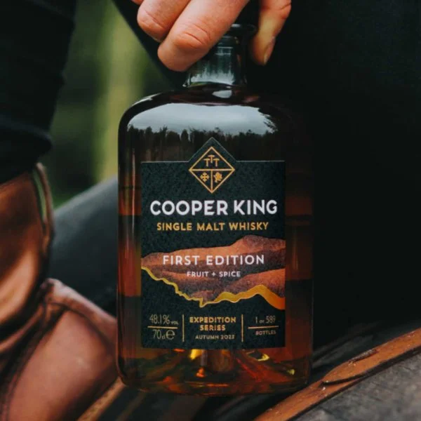


The gold band running along the front depicts the River Wharfe, which merges with the River Ouse before flowing into the Humber and out to the North Sea. It symbolises our ‘liquid gold’ and strong Yorkshire spirit.
The broad, coloured band behind it represents Ingleborough, the second-highest - and arguably the most iconic and picturesque - mountain in the Yorkshire Dales. This stunning region is where much of Yorkshire Dales Millennium Trust’s environmental and apprentice work happens.
Through the bottle on the reverse of the back label, you’ll catch a glimpse of Cradle Mountain in Tasmania - the birthplace of our whisky adventure! Look closely, and you’ll spot footprints taken from the very boots we wore when we climbed it back in 2014.
This level of detail is what you get when an architect and a scientist run a distillery - everything must exist for a reason!
A big thanks to Yorkshire-based designer James Everitt, who helped turn our ideas into reality.
Explore further:
Understand how our whisky funds life-changing apprenticeships for young people in rural England.
Read more about how we make single malt whisky.
Buy a bottle of whisky through the online shop.